1. Blubel — User Experience
Joao Gil for Blubel / 2016
For iOS and Android
Set your Route. Cycle.
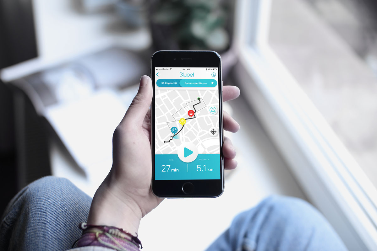
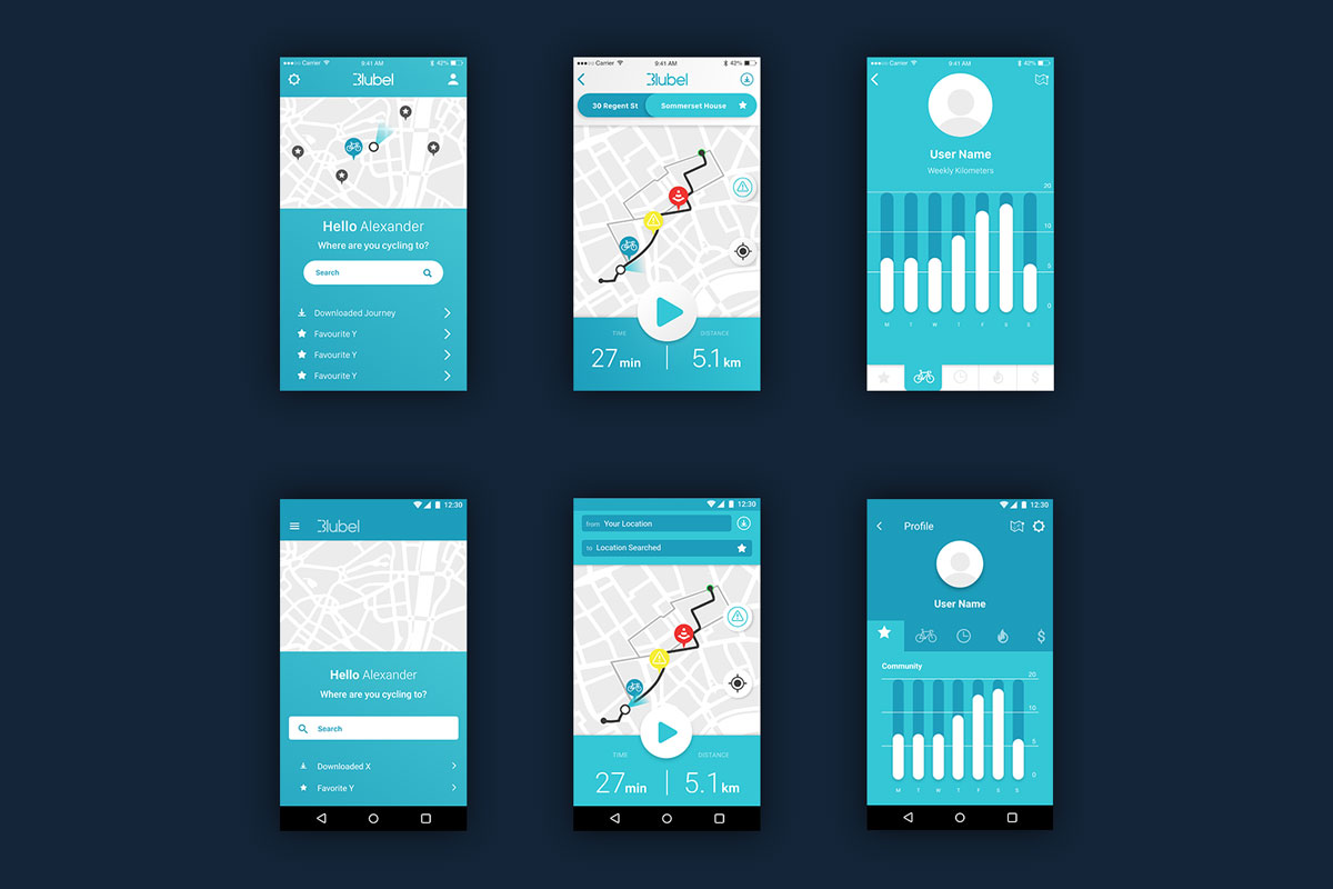
This project looks at the User Interface design for Blubel. After the development of the user experience design, I was recruited by the team to develop the interface for the Blubel iOS and Android mobile Applications.
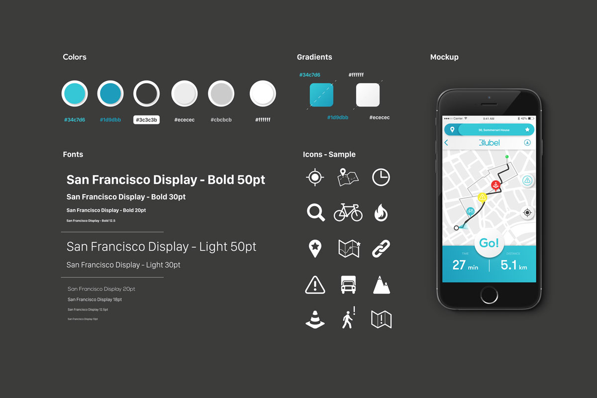
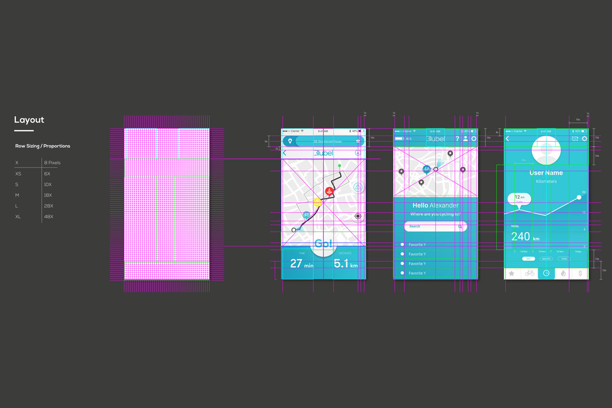
Building from the wireframes previously developed, we translated into design the values of the Blubel brand, crafting meaningful interactions, clear and positive colors and consistant transitions between screens.
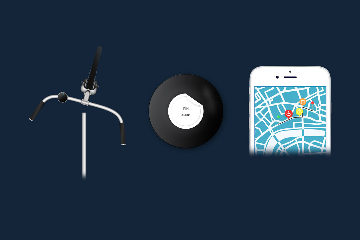
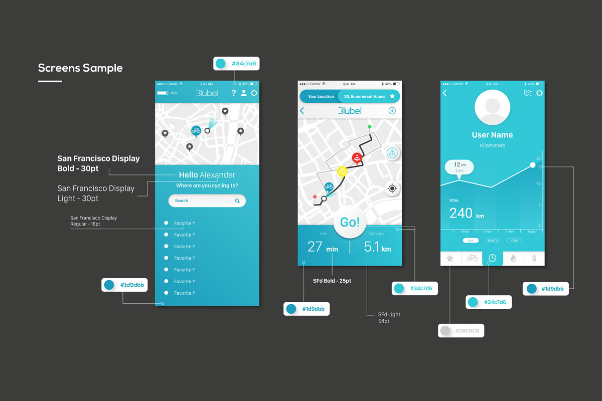
This application works with the Blubel Device, allowing the user to select their best route. Using the app, users can search for their destination and find different journeys types:
A faster journey and a more quiet route using backroads.
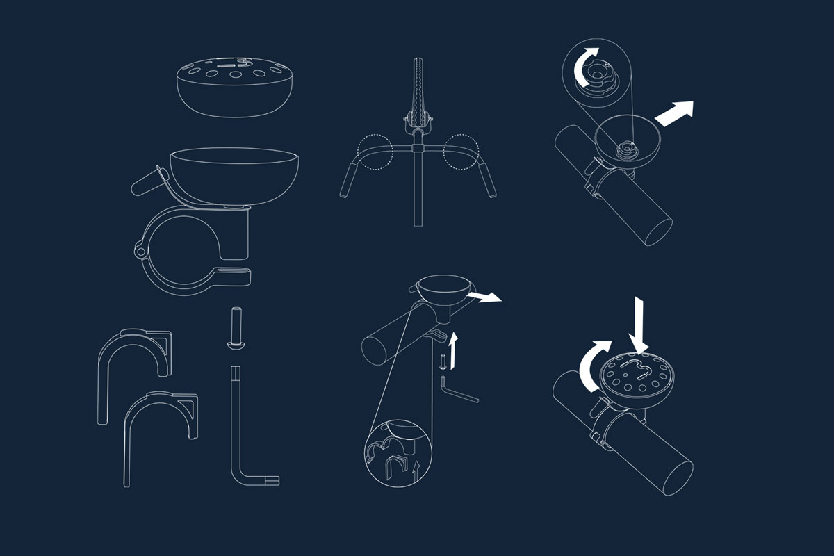
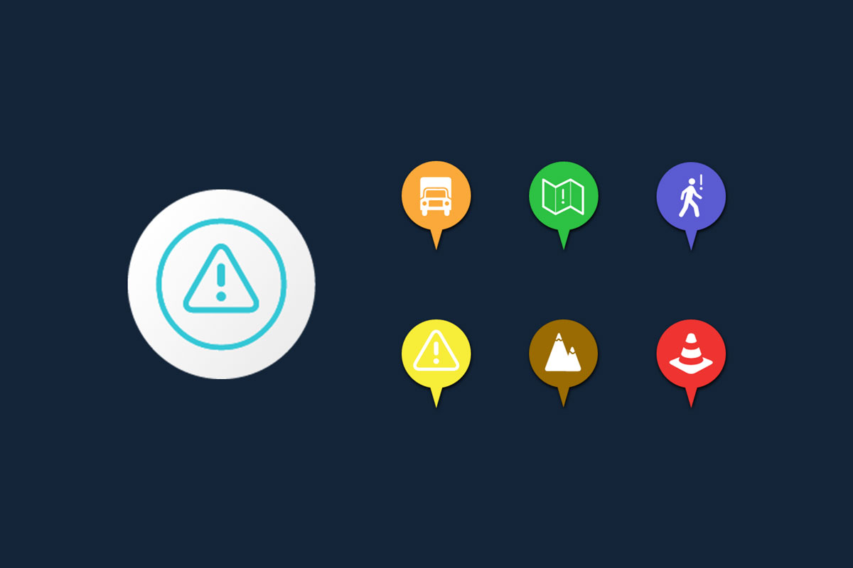
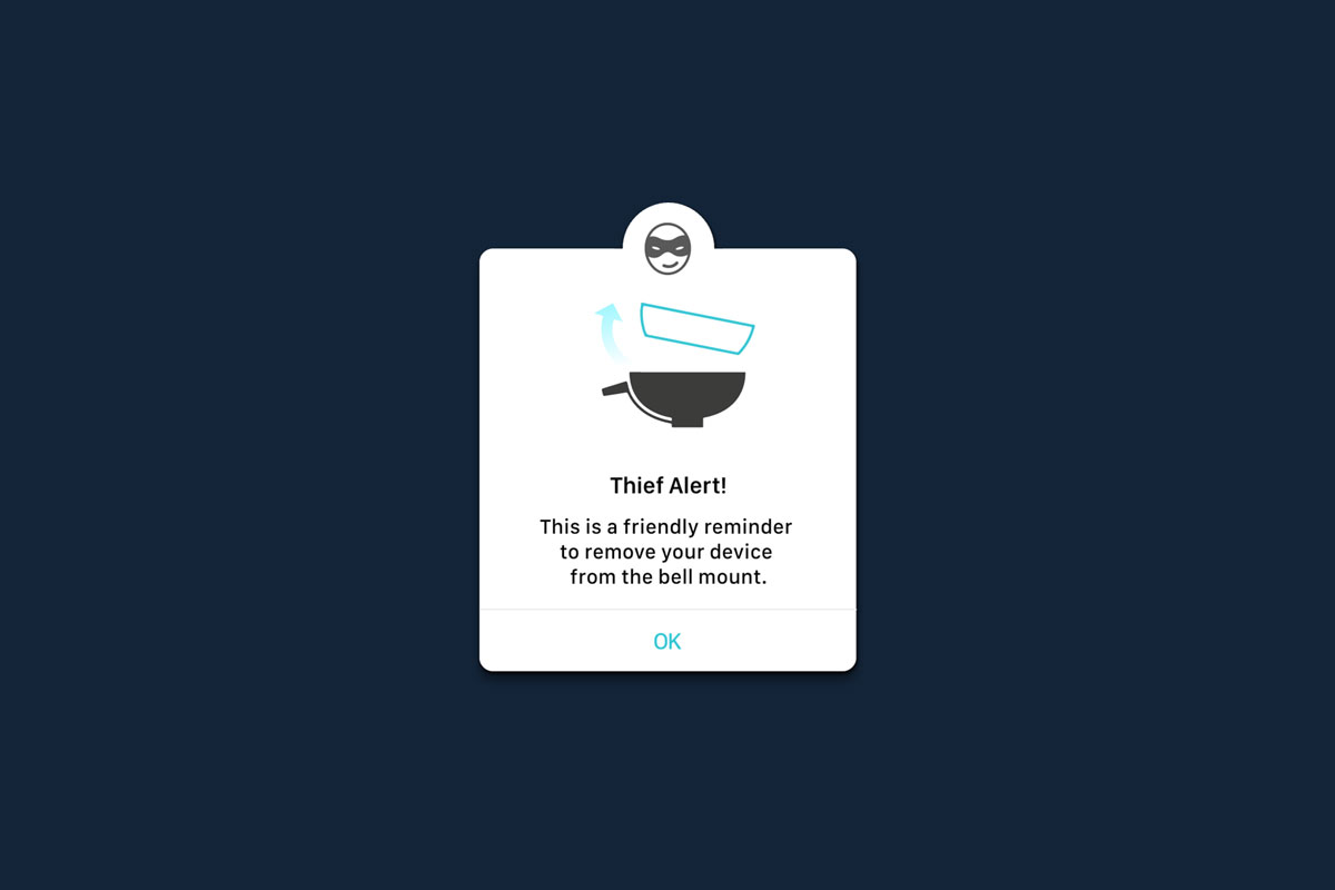
The mobile app will then prompt the user to lock their mobile phone and start using their Blubel device to navigate. The device then signals each turn towards the destination, allowing an easy cycling experience. Upon arrival, the device fully lights up, marking the end of the journey. Howerver, if a cyclist faces any problem during their journey, they can simply ring the bell to drop pins in a map. Once the journey is finished they will be asked to share with the community any problems in their journey, from traffic, potholes, trucks, careless passerbys, etc. This way cyclists using Blubel can easily share insights towards finding the best routes to cycle around the world.
Joao Gil for Blubel / 2016
Stage Visual Design
Joao Gil for Blubel / 2016
Image User Interface
Joao Gil for Blubel / 2016
Image iOS & Android Designs
Links
︎
︎ • ︎ • ︎