2. Logo Design


Joao Gil for Difusor Productions
Logo Design
Brand Identity.
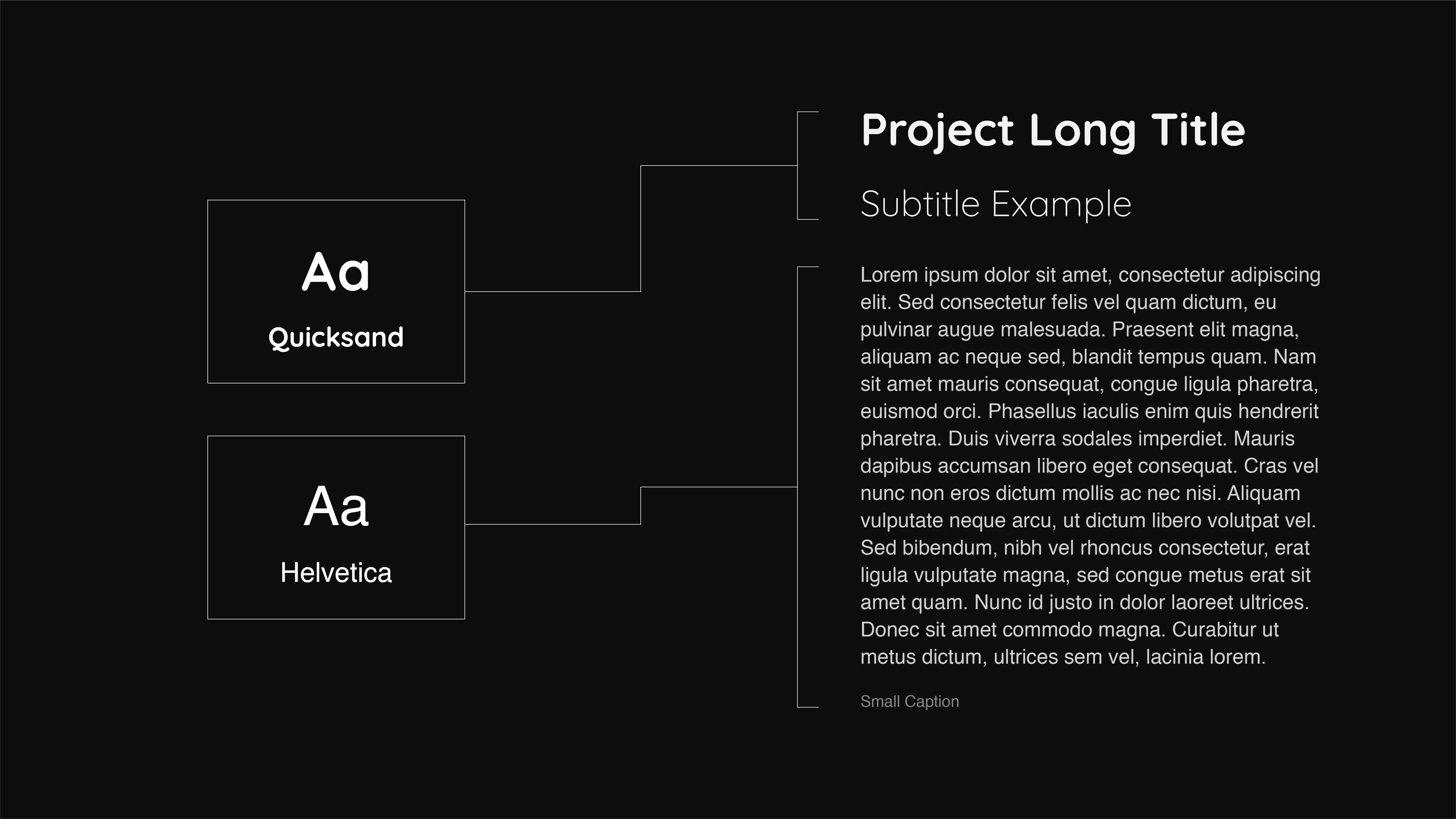
We developed the Logo, colour scheme and typography for Difusor.
Difusor aims to raise awareness and thus spread or difuse contemporary classical music via releases, videos, events and interviews.
We created a minimal aesthetic by creating a simple pallet between black and white, with enough shades to give richness to backgrounds and typography, thus accentuating spaces within layouts and facilitating reading times.
The typography used for the headers contrasts with traditional classical music aesthetics, by being extremly round and fun by contrasting rounded terminals with clear geometric shapes.
This contributes to a more contemporary and entertaining look and feel to the brand, which in in synergy with their aim of reaching new audiences.
The logotype also clearly illustrates their mission of reaching new audiences by difusing and gently blurring the typography, giving it a dynamic effect that seems to be spreading.
This also draws parallel not only with their goals but also with the difficult of containing Classic Contemporary Music as a genre but more has a boundless grey areas of music in expansion.
To ensure that the logo would be legible in smaller formats was also created a breaking point for the logo in which a lesser diffuse version should be used.